


The site design contrasts rich black with white backgrounds and red highlights, echoing the visual language we established through photography, and creating a sophisticated atmosphere. Striking typography creates a strong hierarchy for content, and subtle graphic devices are used to guide navigation without distraction from the key content.


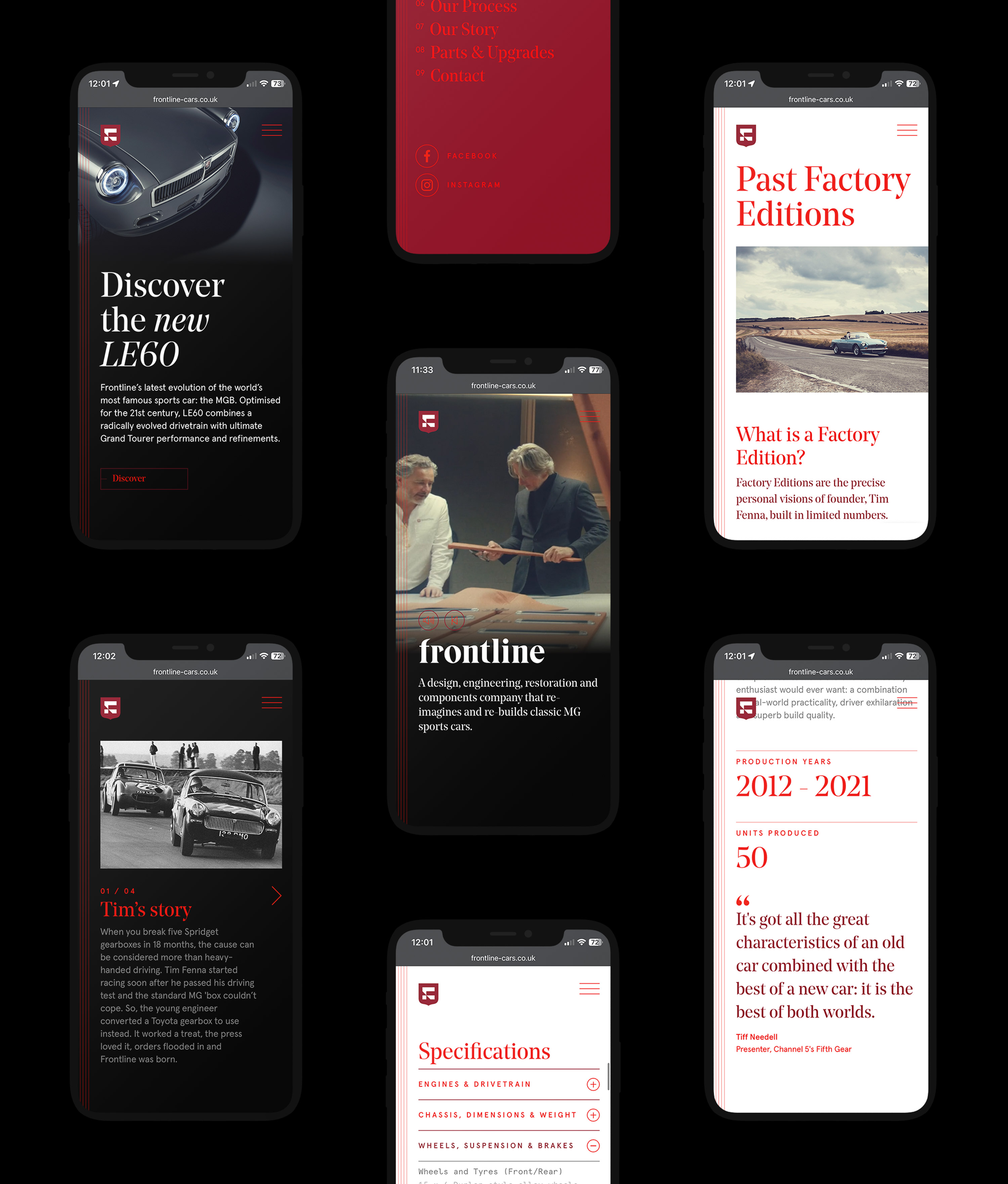
The finished site strikes a powerful balance between form and function. It’s a digital flagship for the brand that is informative without being overwhelming. No opportunity is missed to spark desire and immerse the user in the thrill of owning a Frontline car.


